BRAVE | LIQUID | 3D Visualising | Brave Packaging
BRAVE | LIQUID
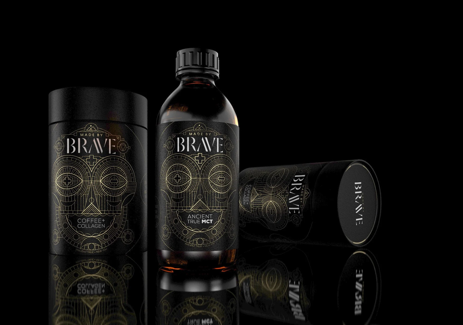
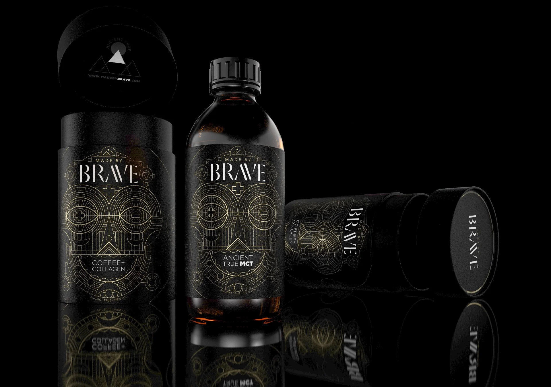
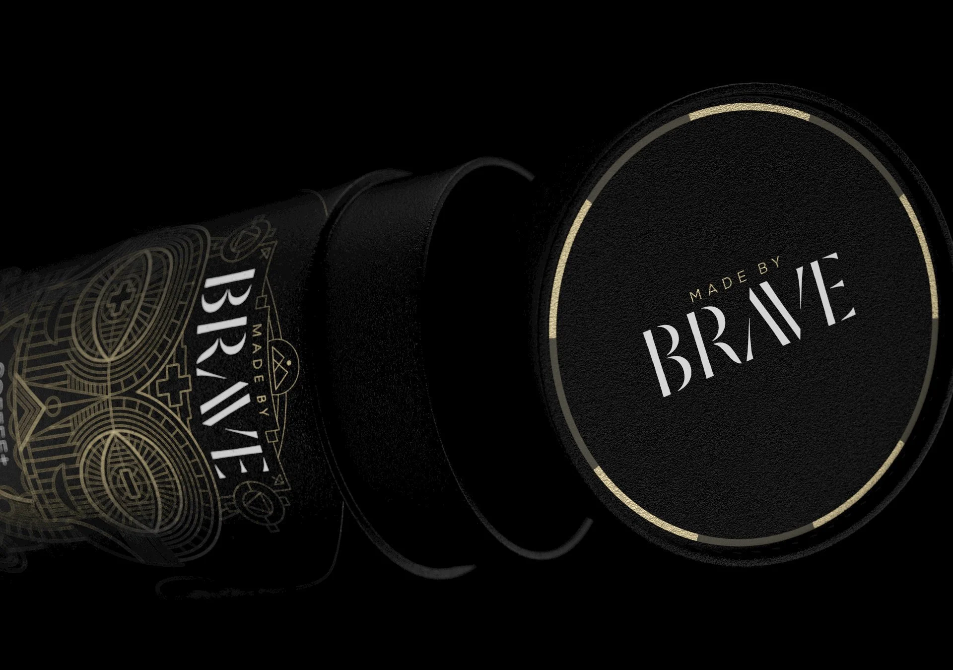
This self-initiated 3D packaging visualisation project revisits a brand I previously worked on as a packaging artworker, using digital rendering to re-explore the physical presence and premium detailing of the Brave product range. The focus was on translating established brand assets into photorealistic 3D visuals that feel tactile, grounded, and confidently understated.
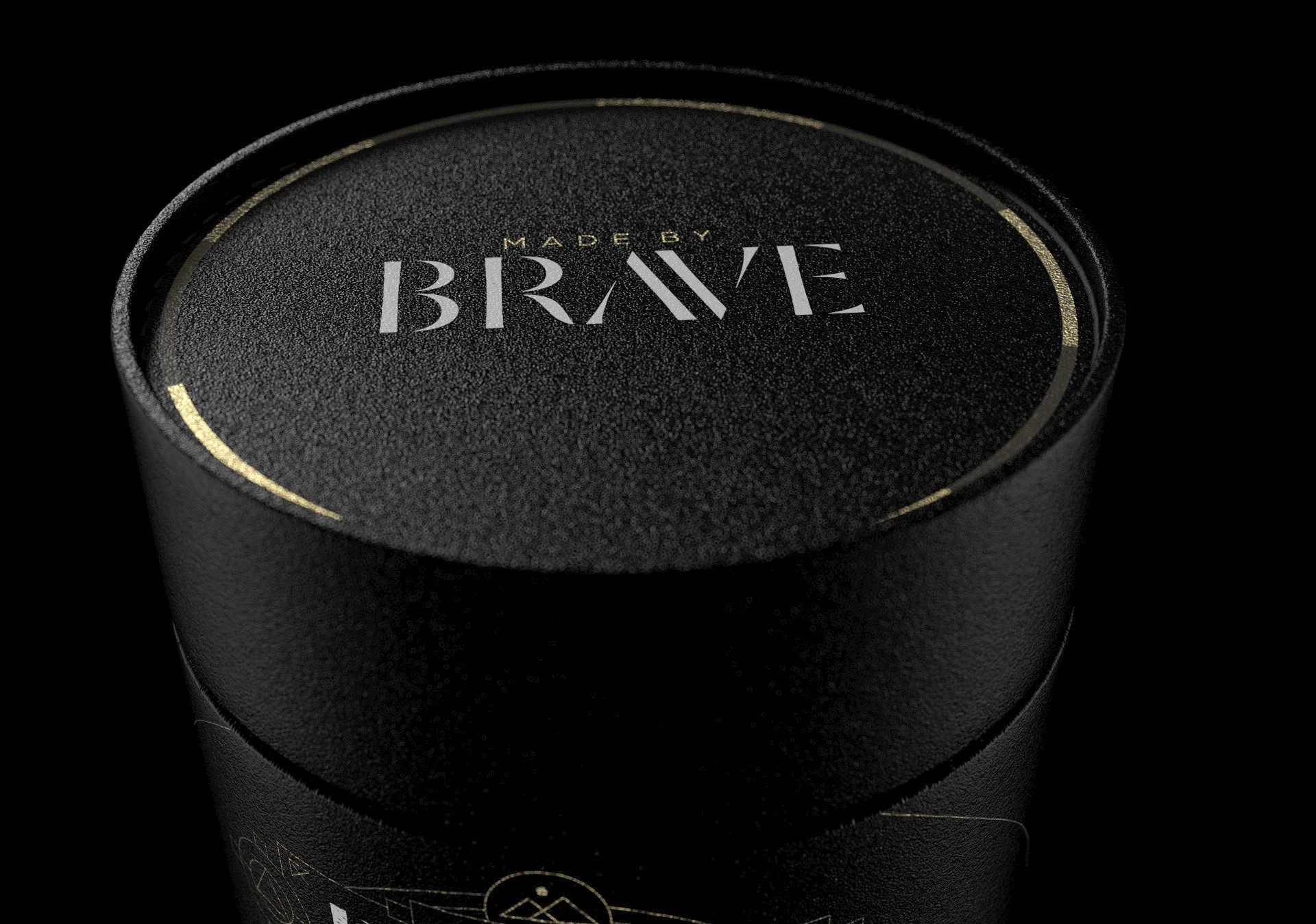
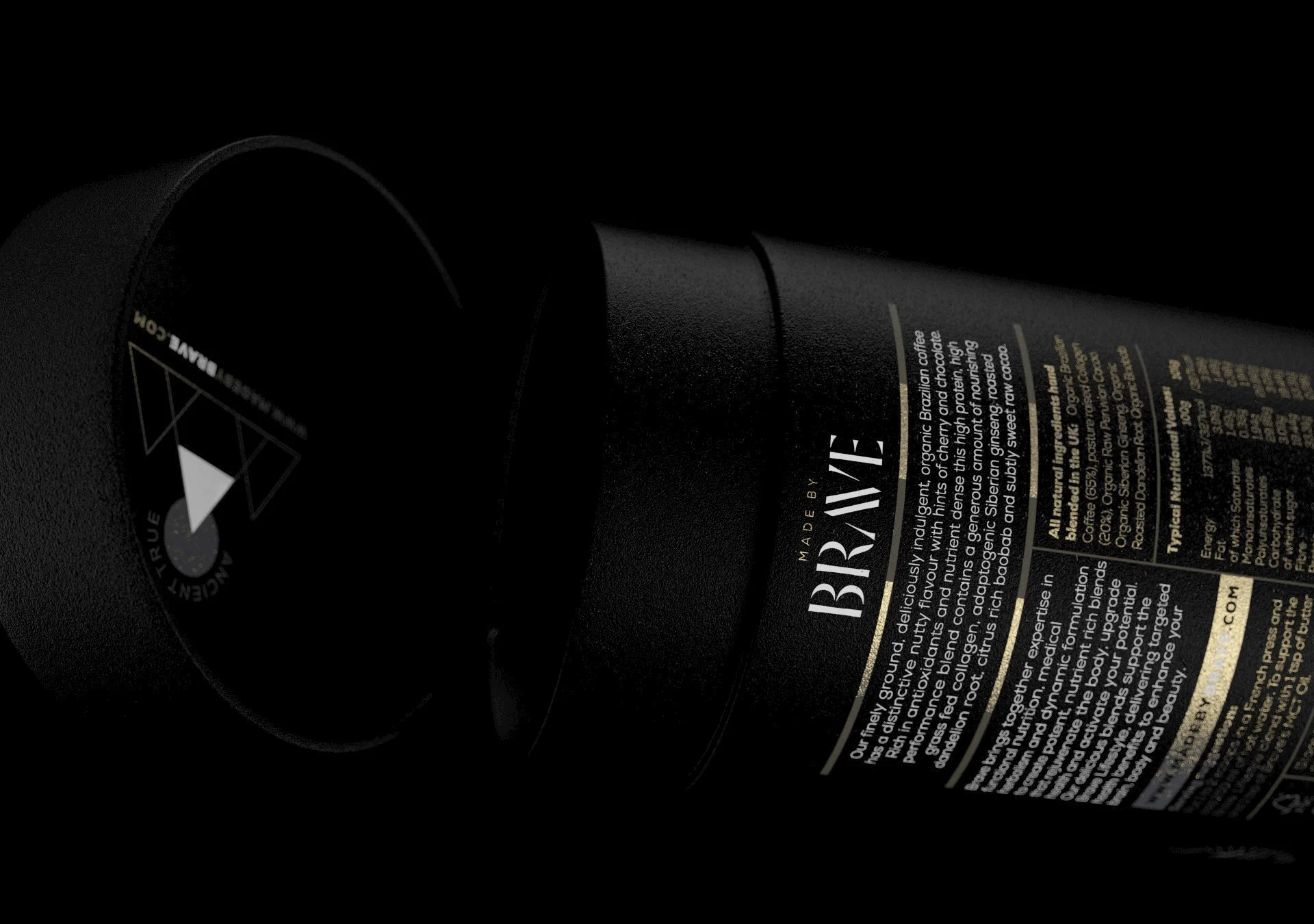
Built around a physically accurate, linear workflow, the renders were developed to faithfully reproduce the interaction of light with matte coatings, printed substrates, embossed detail, and metallic finishes. Particular attention was given to microsurface variation, edge softness, and subtle wear — the small, often overlooked cues that give packaging weight, credibility, and a sense of being held rather than simply viewed.
Lighting was deliberately restrained and directional, designed to enhance contrast and depth without overpowering the brand’s graphic language. Black-on-black surfaces, gold detailing, and controlled reflections were balanced to maintain legibility while reinforcing a premium, understated aesthetic. Composition was treated as an extension of the packaging design itself — measured, deliberate, and uncluttered.
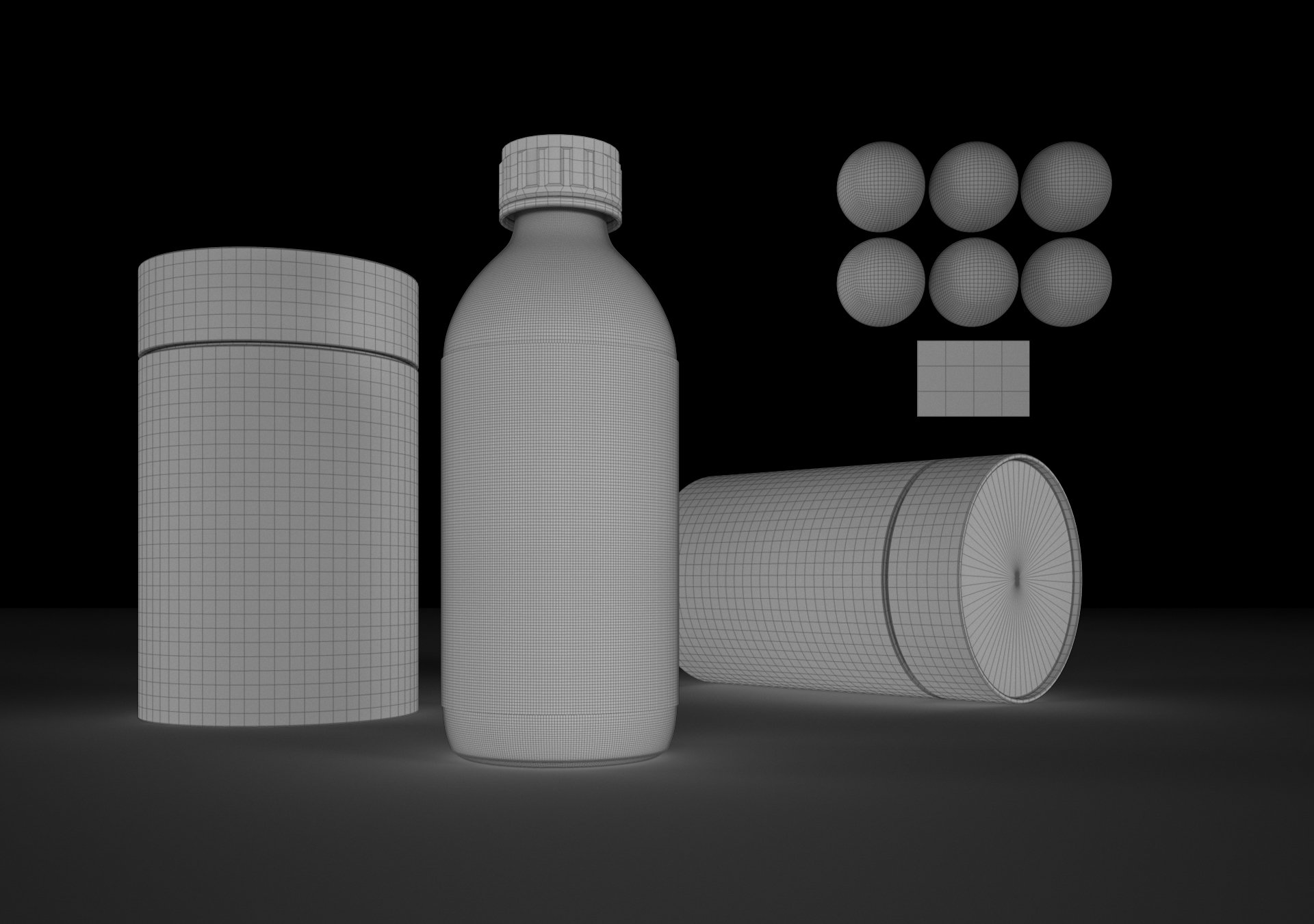
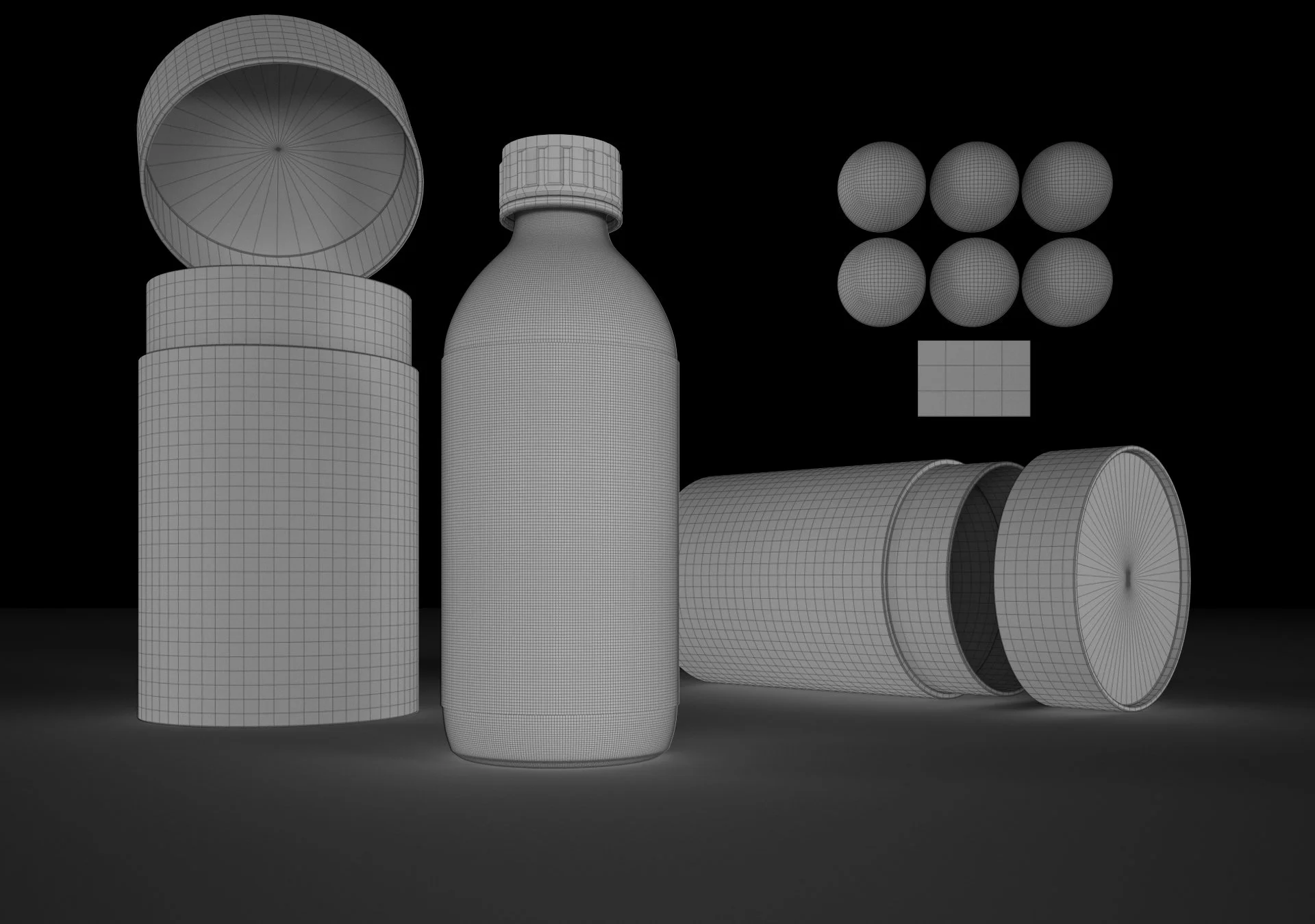
This series also functioned as a technical study in translating 2D artwork into dimensional form. Label wrap, curvature, registration, and real-world tolerances were all considered to ensure the renders felt grounded in physical reality rather than idealised CGI. The goal was not reinvention, but respect — allowing the existing design to breathe in three dimensions.
With full control over camera, lighting, and material response, the project demonstrates how 3D visualisation can support packaging storytelling, elevate presentation, and extend the lifespan of established brand work. These images celebrate the craft behind packaging design — rendered with precision, sensitivity, and an emphasis on realism over spectacle.